Grade 8 Students will find the Big Ideas Math Answers Chapter 6 Data Analysis and Displays extremely helpful to gain knowledge on the concepts. Enhance your problem-solving ability and math proficiency by consistently practicing using the Big Ideas Math Grade 8 Answers Ch 6 Data Analysis and Displays. Seek the homework help needed by availing these quick resources and score better grades in exams. Elaborate Solutions given by subject experts in the BIM book Grade 8 Chapter 6 Answer Key makes it easy for you to gain a good grip on the concepts.
Big Ideas Math Book 8th Grade Answer Key Chapter 6 Data Analysis and Displays
Test your preparation standards taking the help of these handy resources for Big Ideas Math Book 8th Grade Ch 6 Data Analysis and Displays Solutions and improve on the areas of need. Achieve Learning Targets and succeed in your math journey easily. Download the 8th Grade Big Ideas Math Book Ch 6 Data Analysis and Displays Answers in PDF Format via quick links and prepare anywhere and anytime.
Performance Task
- Data Analysis and Displays STEAM Video/Performance Task
- Data Analysis and Displays Getting Ready for Chapter 6
Lesson: 1 Scatter Plots
Lesson: 2 Lines of Fit
Lesson: 3 Two-Way Tables
Lesson: 4 Choosing a Data Display
Chapter: 6 – Data Analysis and Displays
- Data Analysis and Displays Connecting Concepts
- Data Analysis and Displays Chapter Review
- Data Analysis and Displays Practice Test
- Data Analysis and Displays Cumulative Practice
Data Analysis and Displays STEAM Video/Performance Task
STEAM Video
Fuel Economy
The fuel economy of a vehicle is a measure of the effciency of the vehicle’s engine. What are the benefits of using a car with high fuel economy?

Watch the STEAM Video “Fuel Economy.” Then answer the following questions.
1. Tory says that the footprint of a vehicle is the area of the rectangle formed by the wheel base and the track width. What is the footprint of a car with a wheel base of 106 inches and a track width of 61 inches?
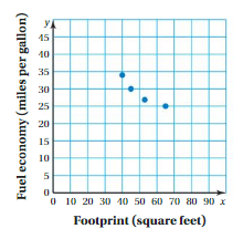
2. The graph shows the relationship between the fuel economy and the footprint for four vehicles.
a. What happens to the fuel economy as the footprint increases?
b. Plot the point (50, 40) on the graph. What does this point represent? Does the point fit in with the other points? Explain.
Answer:
1.The footprint of a car = 6,466 sq inches.
Explanation:
In the above-given question,
Tory says that the footprint of a vehicle is the area of the rectangle formed by the wheelbase and the track width.
area of rectangle = length x width
Given that the footprint of a car = 106 inches.
width with 61 inches.
area = 106 x 61
footprint = 6,466 sq inches.
Answer:
2. a.The fuel economy increases when the footprint increases.
Explanation:
In the above-shown video,
tory says that whenever the footprint increases the fuel economy also increases.
whenever the footprint decreases the fuel economy decreases.
Answer:
2.b.The point (50, 40) represents the outlier.
Explanation:
In the above-given graph,
the point (50, 40) lies in the graph.
it represents the outlier of the graph.
Performance Task
Cost vs. Fuel Economy
After completing this chapter, you will be able to use the STEAM concepts you learned to answer the questions in the Video Performance Task. You will be given fuel economies and purchase prices of hybrid and non hybrid car models.
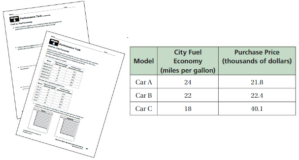
You will be asked to create graphs to compare car models. Why might you want to know the relationship between the fuel economy and the purchase price of a vehicle?
Answer:
The relationship between the fuel economy and the purchase price of a vehicle is proportional.
Explanation:
In the above-given figure,
Given that the city fuel Economy and the purchase price of the cars.
for car A (21.8, 24)
for car B(22.4, 22)
for car C(40.1, 18)
if the fuel economy increases the purchase price also increases.
whenever the economy decreases the purchase price also decreases.
Data Analysis and Displays Getting Ready for Chapter 6
Chapter Exploration
1. Work with a partner. The table shows the number of absences and the final grade for each student in a sample.
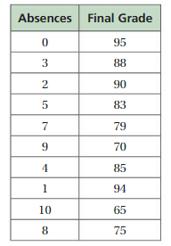
a.Write the ordered pairs from the table. Then plot them in a coordinate plane.
b. Describe the relationship between absences and final grade.
c. MODELING A student has been absent6 days. Use the data to predict the student’s final grade. Explain how you found your answer.
Answer:
a. (0, 95), (3, 88), (2, 90), (5, 83), (7, 79), (9, 70), (4, 85), (1, 94), (10, 65), (8, 75).
b. the relationships between the absences and the final grade is decreasing when the absences increases.
c. The student’s final grade is 80.
Explanation:
a. From the above-given figure,
The ordered pairs are:
(0, 95), (3, 88), (2, 90), (5, 83), (7, 79), (9, 70), (4, 85), (1, 94), (10, 65), (8, 75).
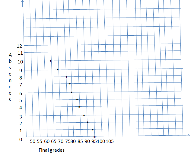
B. whenever the final grade is decreasing the absences also decrease.
whenever the final grade increases the absence also increases.
c. Given that the student has been absent for 6 days.
The student’s final grade is 80.
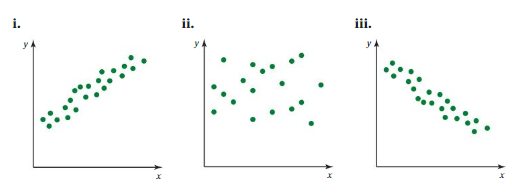
2. Work with a partner. Match the data sets with the most appropriate scatter plot. Explain your reasoning.
a. month of birth and birth weight for infants at a day care
b. quiz score and test score of each student in a class
c. age and value of laptop computers
Vocabulary
The following vocabulary terms are defined in this chapter. Think about what each term might mean and record your thoughts.
scatter plot
two-way table
line of fit
joint frequency
Answer:
Scatter plot = A scatter plot uses dots to represent values for two different numeric variables. The position of each dot on the horizontal and vertical axis indicates values for an individual data point.
Two-way table = A two-way table is a way to display frequencies or relative frequencies for two categorical variables.
Line of fit = Line of fit refers to a line through a scatter plot of data points that best expresses the relationship between those points.
Joint frequency = Joint frequency is joining one variable from the row and one variable from the column.
Explanation:
Scatter plot = A scatter plot uses dots to represent values for two different numeric variables. The position of each dot on the horizontal and vertical axis indicates values for an individual data point.
Two-way table = A two-way table is a way to display frequencies or relative frequencies for two categorical variables.
Line of fit = Line of fit refers to a line through a scatter plot of data points that best expresses the relationship between those points.
Joint frequency = Joint frequency is joining one variable from the row and one variable from the column.
Lesson 6.1 Scatter Plots
EXPLORATION 1
Work with a partner. The weights and circumferences of several sports balls are shown.
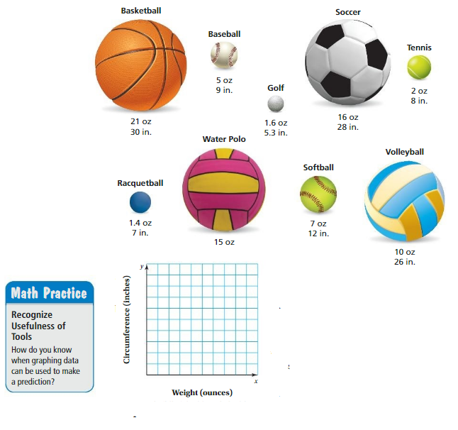
a. Represent the data in the coordinate plane. Explain your method.
b. Is there a relationship between the size and the weight of a sports ball? Explain your reasoning.
c. Is it reasonable to use the graph to predict the weights of the sports balls below? Explain your reasoning.
Kickball : circumference = 26 in.
Bowling ball : circumference = 27 in.
Answer:
a.(21, 30), (5, 9), (1.6, 5.3), (16, 28), (2, 8), (1.4, 7), (7, 12), (10, 26).
Explanation:
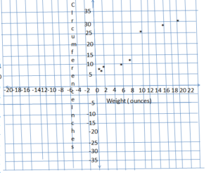
Answer:
b. The weight is measured in inches and size is measured in ounces.
Explanation:
In the above-given figure,
the size and the weight of the balls are given.
size and weight of basketball = (21, 30).
size and weight of baseball = (5, 9).
size and weight of golfball = (1.6, 5.3).
size and weight of soccerball = (16, 28).
size and weight of tennis = (2, 8).
size and weight of racquetball = (1.4, 7).
size and weight of softball = (7, 12).
size and weight of volleyball = (10, 26)
Answer:
c. No, it is not reasonable to use the graph.

Try It
Question 1.
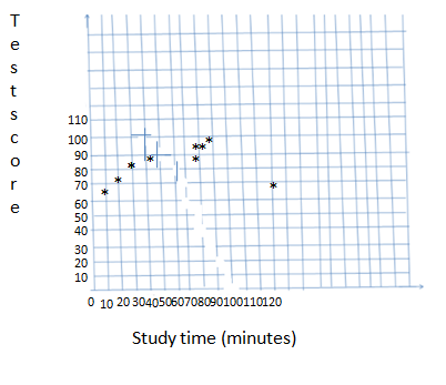
Make a scatter plot of the data. Identify any outliers, gaps, or clusters.

Answer:
outliers = (120, 70)
gaps =(10, 62) to (45, 85)
clusters =(80, 95), (90, 97), (80, 91)
Explanation:
outliers =(120, 70)
gaps = (10, 62) to (45, 85)
clusters = (80, 95), (90, 97), (80, 91)
Question 2.
Describe the relationship between the data in Example 1.
Answer:
Linear relationship.
Explanation:
In the above-given graph,
the relationship used is a linear relationship.
Self-Assessment for Concepts & Skills
Solve each exercise. Then rate your understanding of the success criteria in your journal.
Question 3.
SCATTER PLOT
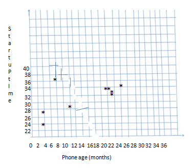
Make a scatter plot of the data. Identify any outliers, gaps, or clusters. Then describe the relationship between the data.

Answer:
outliers = (3,24)
clusters = 22 to 36
gaps = (4, 27), (8, 36)
Explanation:
outliers = (3,24)
clusters = 22 to 36
gaps = (4, 27), (8, 36)
Question 4.
WHICH ONE DOESN’T BELONG?
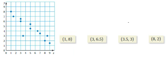
Using the scatter plot, which point does not belong with the other three? Explain your reasoning.
Answer:
The point (3.5, 3) does not belong with the other three.
Explanation:
In the above-given figure
The points (1,8), (3, 6.5), and (8, 2) lies in the coordinate plane.
the point (3.5, 3) does not belong with the other three.
the point (3.5, 3) is an outlier.
Self-Assessment for Problem Solving
Solve each exercise. Then rate your understanding of the success criteria in your journal.
Question 5.
The table shows the high school and college grade point averages (GPAs) of 10 students. What college GPA do you expect for a high school student with a GPA of 2.7?

Answer:
The college GPA I expect for a high school student with a GPA of 2.7 is 2.45.
Explanation:
In the above-given points,
given that the college GPA for high school students.
college GPA for 2.4 = high school students of 2.6
so I am expecting the 2.45 for 2.7.
Question 6.
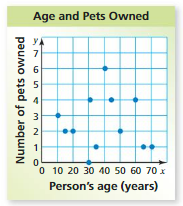
The scatter plot shows the ages of 12 people and the numbers of pets each person owns. Identify any outliers, gaps, or clusters. Then describe the relationship between the data.
Answer:
outliers = (40, 6)
clusters = (20, 2) to (70, 1)
gaps = (0, 30), (1, 35), (2, 50) and so on.
Explanation:
Given that,
the person’s age (years) in the x-axis.
a number of pets owned in the y-axis.
outliers = (40, 6)
clusters = (20, 2) to (70, 1)
gaps = (0, 30), (1, 35), (2, 50) and so on.
Scatter Plots Homework & Practice 6.1
Review & Refresh
Solve the system. Check your solution.
Question 1.
y = – 5x + 1
y = – 5x – 2
Answer:
There is no solution for the given equation.
Explanation:
Given that y = – 5x + 1
y = – 5x – 2
so there is no solution for the given equation.
Question 2.
2x + 2y = 9
x = 4.5 – y
Answer:
9 = 9
Explanation:
Given that,
2x + 2y = 9
x = 4.5 – y
2(4.5 – y) + 2y = 9
9 – 2y + 2y = 9
-2y and + 2y get cancelled on both sides.
9 = 9
Question 3.
y = – x
6x + y = 4
Answer:
x = (4/5 , -4/5)
Explanation:
Given that y = -x
6x + y = 4
6x + (-x) = 4
6x – x = 4
5x = 4
x = (4/5)
Question 4.
When graphing a proportional relationship represented by y = mx, which point is not on the graph?
A. (0, 0)
B. (0, m)
C. (1, m)
D. (2, 2m)
Answer:
Point A is not on the graph.
Explanation:
In the above question,
given that the points are:
(0, 0)
(0, m)
(1, m)
(2, 2m)
the point (0, 0) is not in the graph.
Concepts, Skills, &Problem Solving
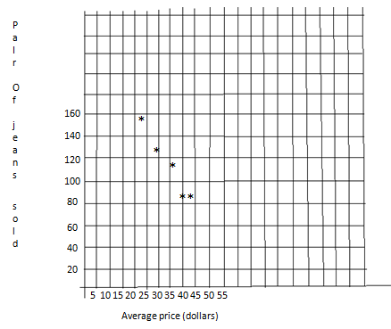
USING A SCATTER PLOT The table shows the average prices (in dollars) of jeans sold at different stores and the numbers of pairs of jeans sold at each store in one month. (See Exploration 1, p. 237.)
Question 5.
Represent the data in a coordinate plane.

Answer:
The points are (22, 152), (40, 94), (28, 134), (35, 110), and (46, 81)
Explanation:
In the above-given figure,
The points are (22, 152), (40, 94), (28, 134), (35, 110), and (46, 81)
Question 6.
Is there a relationship between the average price and the number sold? Explain your reasoning.
Answer:
The linear relationship.
Explanation:
In the above-given figure,
the relationship given is linear relationship.
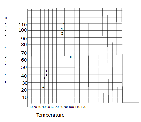
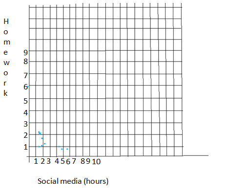
MAKING A SCATTER PLOT Make a scatter plot of the data. Identify any outliers, gaps, or clusters.
Question 7.

Answer:
Outliers = (102, 63)
gaps = x from 40 to 44
clusters = 82 to 89
Explanation:
outliers = (102, 63)
gaps = x from 40 to 44
clusters = 82 to 89
Question 8.

Answer:
Outliers = (0, 5.5)
gaps = x from 4.5 to 5.5
clusters = 1.5 to 2.5
Explanation:
outliers = (0, 5.5)
gaps = x from 4.5 to 5.5
clusters = 1.5 to 2.5
IDENTIFYING RELATIONSHIPS Describe the relationship between the data. Identify any outliers, gaps, or clusters.
Question 9.
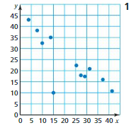
Answer:
Outliers = (15, 10)
gaps = from x = 15 to x = 25
clusters = 0
Negative linear relationship.
Explanation:
Outliers = (15, 10)
gaps = from x = 15 to x = 25
clusters = 0
There are no clusters.
Question 10.
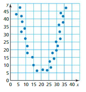
Answer:
There are no clusters.
gaps = from x = 4 to x = 36
outliers.
Explanation:
In the above-given figure,
there are no clusters.
gaps = from x = 4 to x = 36
no outliers.
Question 11.
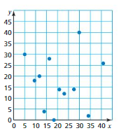
Answer:
There is no relationship.
there are no clusters.
no gaps.
no outliers.
Explanation:
In the above-given graph,
there are no clusters.
no gaps.
no clusters.
there is no relationship.
Question 12.
CRITICAL THINKING
The table shows the average price per pound for honey at a store from 2014 to 2017. Describe the relationship between the data.

Answer:
The relationship is a positive linear relationship.
Explanation:
In the above-figure,
given points are:
(2014, $4.65), (2015, $5.90), (2016, $6.50), and (2017, $7.70)
so the above given is a positive linear relationship.
Question 13.
MODELING REAL LIFE
The scatter plot shows the amount of rainfall and the amount of corn produced by a farm over the last 10 years. Describe the relationship between the amount of rainfall and the amount of corn produced.
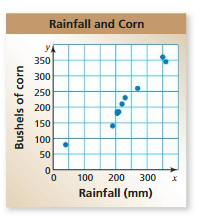
Answer:
The relationship is a positive linear relationship.
Explanation:
In the above-given figure,
outliers = (49, 80)
clusters = from x = 190 to 220.
Question 14.
OPEN-ENDED
Describe a set of real-life data that has a negative linear relationship.
Answer:
Question 15.
MODELING REAL LIFE
The scatter plot shows the total earnings (wages and tips) of a food server during one day.
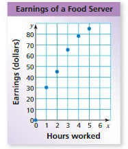
a. About how many hours must the server work to earn $70?
b. About how much does the server earn for 5 hours of work?
c. Describe the relationship shown by the data.
Answer:
a. 3.5 h
b. 85 $
c. positive linear relationship.
Explanation:
In the above-given graph,
given that,
a. the hours must server work to earn $70 = 3.5 h
b. The server earns for 5 hours of work = $ 85.
c. the relationship is shown by the data = positive linear relationship.
Question 16.
PROBLEM SOLVING
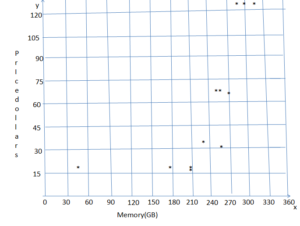
The table shows the memory capacities (in gigabytes) and prices (in dollars) of tablet computers. (a) Make a scatter plot of the data. Then describe the relationship between the data. (b) Identify any outliers, gaps, or clusters. Explain why they might exist.

Answer:
Outliers =(16, 50)
gaps = 128 on x.
clusters = 64, 32, 64
Explanation:
Outliers =(16, 50)
gaps =128 on x.
clusters = 64, 32, 64.
Question 17.
PATTERNS
The scatter plot shows the numbers of drifting scooters sold by a company.
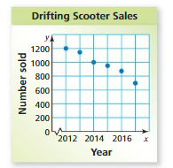
a. In what year were1000 scooters sold?
b. About how many scooters were sold in 2015?
c. Describe the relationship shown by the data.
d. Assuming this trend continues, in what year are about 500 drifting scooters sold?
Answer:
a. 2014
b. about 950 scooters.
c. negative linear relationship.
d. 2019.
Explanation:
In the above-given figure,
Given that the number of vehicles sold in the year.
a. 2014
b. about 950 scooters.
c. negative linear relationship.
d. 2019
Question 18.
DIG DEEPER!
Sales of sunglasses and beach towels at a store show a positive linear relationship in the summer. Does this mean that the sales of one item cause the sales of the other item to increase? Explain.
Answer:
Yes.
Explanation:
In the above-figure,
given that the sales of the sunglasses and beach towels at a store show a positive linear relationship.
yes the sales of one item cause the sales of the other item to increase.
Lesson 6.2 Lines of Fit
EXPLORATION 1
Representing Data by a Linear Equation
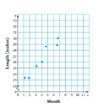
Work with a partner. You have been working on a science project for 8 months. Each month, you measured the length of a baby alligator.
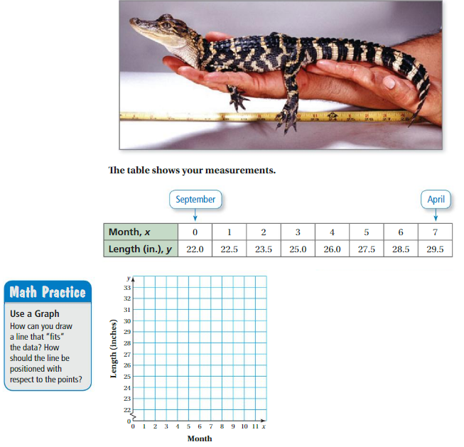
a. Use a scatter plot to draw a line that you think best describes the relationship between the data.
b. Write an equation for your line in part(a).
c. MODELING Use your equation in part(b) to predict the length of the baby alligator next September.
Answer:
a. The relation is a linear relationship.
Explanation:
Try It
Question 1.
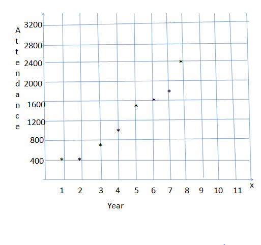
The table shows the numbers of people who attend a festival over an eight-year period. (a) Make a scatter plot of the data and draw a line of fit. (b) Write an equation of the line of fit. (c) Interpret the slope and the y-intercept of the line of fit.

Answer:
The order pairs (1, 420), (2, 500), (3, 650), (4, 900), (5, 1100), (6, 1500), (7, 1750), (8, 2400)
Explanation:
Question 2.
Find an equation of the line of best fit for the data in Example 1. Identify and interpret the correlation coefficient.
Answer:
Self-Assessment for Concepts & Skills
Solve each exercise. Then rate your understanding of the success criteria in your journal.
Question 3.
FINDING A LINE OF FIT
The table shows the numbers of days spent training and the race times for several people in a race.
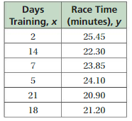
a. Make a scatter plot of the data and draw a line of fit.
b. Write an equation of the line of fit.
c. Interpret the slope and the y-intercept of the line of fit.
Answer:
Question 4.
IDENTIFYING RELATIONSHIPS
Find an equation of the line of best fit for the data at the left. Identify and interpret the correlation coefficient
Answer:
Self-Assessment for Problem Solving
Solve each exercise. Then rate your understanding of the success criteria in your journal.
Question 5.
The ordered pairs show amounts y (in inches) of rainfall equivalent x to inches of snow. About how many inches of rainfall are equivalent to 6 inches of snow? Justify your answer.
(16, 1.5) (12, 1.3) (18, 1.8) (15, 1.5) (20, 2.1) (23, 2.4)
Answer:
Question 6.
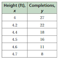
The table shows the heights (in feet) of a high jump bar and the number of people who successfully complete each jump. Identify and interpret the correlation coefficient.
Answer:
Lines of Fit Homework & Practice 6.2
Review & Refresh
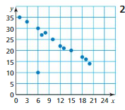
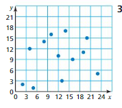
Describe the relationship between the data. Identify any outliers, gaps, or clusters.
Question 1.
Answer:
Negative linear relationship.
outliers = (6, 10)
clusters = 0
gaps = 0
Explanation:
In the above-given figure,
The relationship is negative linear relationship.
outliers = (6, 10)
cluster = 0
gaps = 0
there are no clusters and no gaps.
Question 2.
Answer:
Question 3.
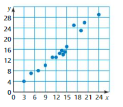
Answer:
positive linear relationships.
outliers = 0
gaps = 0
clusters = x = 11 to x = 15
Explanation:
In the above-given figure,
given that
positive linear relationship.
outliers = 0
gaps = 0
clusters = x = 11 to x = 15
Write the fraction as a decimal and a percent.
Question 4.
\(\frac{29}{100}\)
Answer:
Decimal = 0.29
percent = 29 %
Explanation:
Given that
(29/100)
0.29
percent = 29%
decimal = 0.29
Question 5.
\(\frac{7}{25}\)
Answer:
Decimal = 0.28
percent = 28%
Explanation:
Given that
(7/25) = 0.28
decimal = 0.28
percent = 28
Question 6.
\(\frac{35}{50}\)
Answer:
Decimal = 0.7
percent = 0.007
Explanation:
Given that
(35/50) = 0.7
decimal = 0.7
percent = 0.007
Concepts, Skills, &Problem Solving
REPRESENTING DATA BY A LINEAR EQUATION Use a scatter plot to draw a line that you think best describes the relationship between the data. (See Exploration 1, p. 243.)
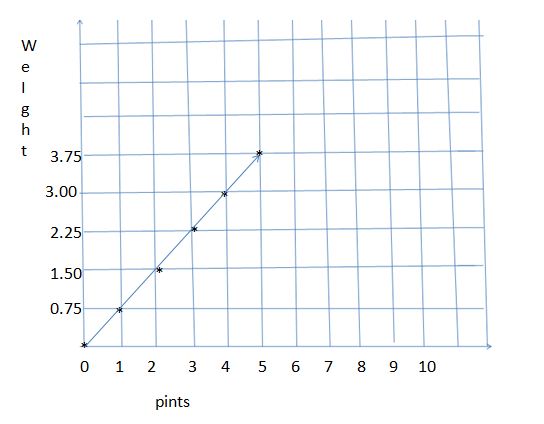
Question 7.

Answer:
The points are (0,0), (1, 0.8), (2, 1.50), (3, 2.20), (4, 3.0), (5, 3.75)
Explanation:
In the above-given figure,
Given that :
the points are (0, 0), (1, 0.8), (2, 1.50), (3, 2.20), (4, 3.0), (5, 3.75)
The blue berries are in the x-axis.
weight is measured in pounds.
weight is shown in the y-axis.
Question 8.

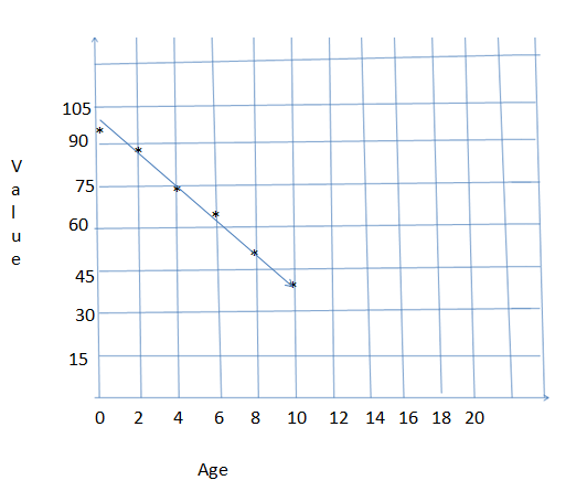
Answer:
The given points are (0,91), (2, 82), (4, 74), (6, 65), (8, 55), (10, 43).
Explanation:
In the above-given figure,
Given that :
the points are (0, 91, (2, 82), (4, 74), (6, 65), (8, 55), (10, 43)
The Age is given on the x-axis.
value is measured in dollars.
value is given in the y-axis.
Question 9.
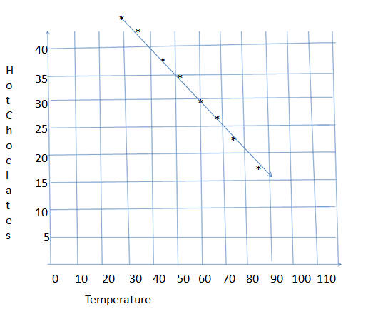
FINDING A LINE OF FIT
The table shows the daily high temperatures (°F)and the numbers of hot chocolates sold at a coffee shop for eight randomly selected days.

a. Make a scatter plot of the data and draw a line of fit.
b.Write an equation of the line of fit.
c. Interpret the slope and the y-intercept of the line of fit.
Answer:
a.The given points are (30, 45), (36, 43), (44, 36), (51, 35), (60, 30), (68, 27), (75, 23), (82, 17).
b. y = -0.5x + 60
c. you could expect that 60 hot chocolates are sold when the temperature is 0 degree f, and the sales decrease by 1 hot chocolate for every 2 degrees f increase in temperature.
Explanation:
a.The given points are (30, 45), (36, 43), (44, 36), (51, 35), (60, 30), (68, 27), (75, 23), (82, 17).
b. y = -0.5x + 60
c. you could expect that 60 hot chocolates are sold when the temperature is 0 degree f, and the sales decrease by 1 hot chocolate for every 2 degrees f increase in temperature.
Question 10.
NUMBER SENSE
Which correlation coefficient indicates a stronger relationship: – 0.98 or 0.91? Explain.
Answer:
0.91 indicates a stronger correlation coefficient.
Explanation:
In the above-given question,
-0.98 is a negative value and 0.91 is a positive value.
So 0.91 indicates a stronger correlation coefficient.
Question 11.
IDENTIFYING RELATIONSHIPS
The table shows the admission costs (in dollars) and the average number of daily visitors at an amusement park each year for the past 8 years. Find an equation of the line of best fit. Identify and interpret the correlation coefficient.

Answer:
The equation for the line of best fit is Y = -4.9x + 1042
about -0.969.
strong negative correlation.
Explanation:
In the above-given figure,
The given points are (20, 940), (21, 935), (22, 940), (24, 925), (25, 920), (27, 905), (28, 910), and (30, 890)
The equation for the line of best fit is y = -4.9x + 1042.
about -0.969.
strong negative correlation.
Question 12.
REASONING
The table shows the weights(in pounds) and the prescribed dosages (in milligrams) of medicine for six patients.
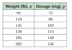
a. Find an equation of the line of best fit. Identify and interpret the correlation coefficient.
b. Interpret the slope of the line of best fit.
c. A patient who weighs 140 pounds is prescribed 135 milligrams of medicine. How does this affect the line of best fit?
Answer:
Question 13.
MODELING REAL LIFE
The table shows the populations (in millions) and the numbers of electoral votes assigned for eight states in the 2016 presidential election.
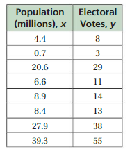
a. Find an equation of the line of best fit. Identify and interpret the correlation coefficient.
b. Interpret the slope of the line of best fit.
c. Interpret the y-intercept of the line of best fit.
d. RESEARCH Research the Electoral College to explain the meaning of your answer in part(c).
Answer:
a. y = 1.3 x + 2; about 0.9995; strong positive correlation.
b. The number of electoral votes increases by 1.3 for every increase of 1 million people in the state.
c. A state with a population of 0 has 2 electoral votes.
d. The number of electoral votes a state has is based on the number of members that the state has in congress. Each state has 2 senators, plus a number of members of the House of Representatives based on its population. so, the y-intercept is 2 because a hypothetical state with no population would still have 2 senators.
Explanation:
a. y = 1.3 x + 2; about 0.9995; strong positive correlation.
b. The number of electoral votes increases by 1.3 for every increase of 1 million people in the state.
c. A state with a population of 0 has 2 electoral votes.
d. The number of electoral votes a state has is based on the number of members that the state has in congress. Each state has 2 senators, plus a number of members of the House of Representatives based on its population. so, the y-intercept is 2 because a hypothetical state with no population would still have 2 senators.
Question 14.
MODELING REAL LIFE
The table shows the numbers (in millions) of active accounts for two social media websites over the past five years. Assuming this trend continues, how many active accounts will Website B have when Website A has 280 million active accounts? Justify your answer.
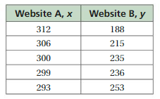
Answer:
Question 15.
DIG DEEPER!
The table shows the heights y(in feet) of a baseball x seconds after it was hit.
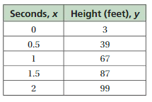
a. Predict the height after 5 seconds.
b. The actual height after 5 seconds is about 3 feet. Why might this be different from your prediction?
Answer:
a. 251 ft.
b. The height of the baseball is not linear.
Explanation:
a. The height after 5 seconds is 251 feet.
Given that the seconds on the x-axis and height on the y-axis.
the points are (0, 3), (0.5, 39), (1, 67), (1.5, 87), and (2, 99).
b. The actual height after 5 seconds is about 3 feet.
Lesson 6.3 Two-Way Tables
EXPLORATION 1
Analyzing Data
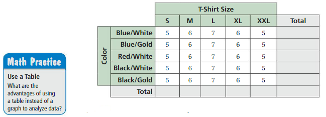
Work with a partner. You are the manager of a sports shop. The table shows the numbers of soccer T-shirts that your shop has left in stock at the end of a soccer season.
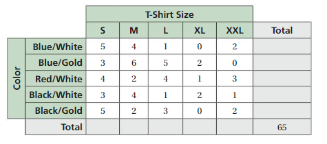
a. Complete the table.
b. Are there any black-and-gold XL T-shirts in stock? Justify your answer.
c. The numbers of T-shirts you ordered at the beginning of the soccer season are shown below. Complete the table.
d. REASONING How would you alter the numbers of T-shirts you order for the next soccer season?
Answer:
Try It
Question 1.
How many students in the survey above studied for the test and failed?
Answer:
Question 2.
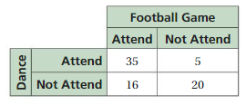
You randomly survey students in a cafeteria about their plans for a football game and a school dance. The two-way table shows the results. Find and interpret the marginal frequencies for the survey.
Answer:
Question 3.
You randomly survey students about whether they buy a school lunch or pack a lunch. The results are shown. Make a two-way table that includes the marginal frequencies.

Answer:
Self-Assessment for Concepts & Skills
Solve each exercise. Then rate your understanding of the success criteria in your journal.
Question 4.
READING A TWO-WAY TABLE
The results of a music survey are shown in the two-way table. How many students dislike both country and jazz? How many students like country but dislike jazz?

Answer:
Question 5.
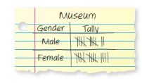
MAKING A TWO-WAY TABLE
You randomly survey students about their preference for a class field trip. The results are shown in the tally sheets. Make a two-way table that includes the marginal frequencies.
Answer:
Self-Assessment for Problem Solving
Solve each exercise. Then rate your understanding of the success criteria in your journal.
Question 6.
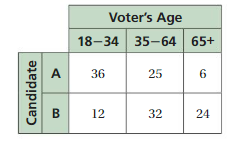
The results of a voting survey are shown in the two-way table. For each age group, what percent of voters prefer Candidate A? Candidate B? Determine whether there is a relationship between age and candidate preference.
Answer:
Question 7.
You randomly survey 40 students about whether they play an instrument. You find that8 males play an instrument and 13 females do not play an instrument. A total of 17 students in the survey play an instrument. Make a two-way table that includes the marginal frequencies.
Answer:
Question 8.
Collect data from each student in your math class about whether they like math and whether they like science. Is there a relationship between liking math and liking science? Justify your answer.
Answer:
Two-Way Tables Homework & Practice 6.3
Review & Refresh
Find an equation of the line of best fit for the data.
Question 1.

Answer:
The line y = 12.6x + 75.8 best fit for the data.
Explanation:
In the above-given figure,
Given that the points are (0,75), (1, 91), (2, 101), (3, 109) and (4, 129).
The line y = 12.6x + 75.8 is the best fit for the data.
Question 2.

Answer:
The vertices of a triangle are A (1, 2), B (3, 1), and C (1, – 1). Draw the figure and its image after the translation.
Question 3.
4 units left
Answer:
Question 4.
2 units down
Answer:
Question 5.
(x – 2, y + 3)
Answer:
Concepts, Skills, &Problem Solving
ANALYZING DATA In Exploration 1, determine how many of the indicated T-shirt are in stock at the end of the soccer season. (See Exploration 1, p. 249.)
Question 6.
black-and-white M
Answer:
4 T-shirts are in stock at the end of the soccer season.
Explanation:
In the above-given Exploration 1,
Given that The T-shirts are in stock.
4 T-shirts are in stock at the end of the soccer season.
Question 7.
blue-and-gold XXL
Answer:
0 shirts.
Explanation:
In the above-given Exploration 1,
Given that The T-shirts are in stock.
0 T-shirts are in stock at the end of the soccer season.
Question 8.
blue-and-white L
Answer:
1 T-shirt.
Explanation:
In the above-given Exploration 1,
Given that the T-shirts are in stock.
1 T-shirt is in stock at the end of the soccer season.
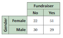
READING A TWO-WAY TABLE You randomly survey students about participating in a yearly fundraiser. The two-way table shows the results.
Question 9.
How many female students participateFundraiserin the fundraiser?
Answer:
51 students participate.
Explanation:
In the above-given table,
Given that male and female students are participated in the fundraiser.
so 51 female students participate.
Question 10.
How many male students do not participate in the fundraiser?
Answer:
30 male students do not participate.
Explanation:
In the above-given table,
Given that male and female students are participated in the fundraiser.
so 30 male students do not participate.
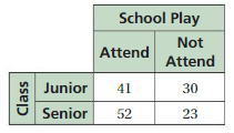
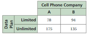
FINDING MARGINAL FREQUENCIES Find and interpret the marginal frequencies.
Question 11.
Answer:
71 students are juniors.
75 students are seniors.
93 students will attend the school play.
53 students will not attend the school play.
146 students were surveyed.
Explanation:
In the above-given table,
Given that students of the class participate in the school play.
71 students are juniors.
75 students are seniors.
93 students will attend the school play.
53 students will not attend the school play.
146 students were surveyed.
Question 12.
Answer:
The data plan of 78 people is limited for the cell phone company A.
The data plan of 94 people is limited for the cell phone company B.
The data plan of 175 people is unlimited for the cell phone company A.
The data plan of 135 people is unlimited for the cell phone company B.
482 people were surveyed.
Explanation:
In the above-given table,
The data plan of the cell phone company are given.
The data plan of 78 people is limited for the cell phone company A.
The data plan of 94 people is limited for the cell phone company B.
The data plan of 175 people is unlimited for the cell phone company A.
The data plan of 135 people is unlimited for the cell phone company B.
482 people were surveyed.
Question 13.
MAKING A TWO-WAY TABLE
A researcher randomly surveys people with a medical condition about whether they received a treatment and whether their condition improved. The results are shown. Make a two-way table that includes the marginal frequencies.
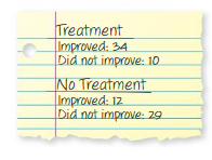
Answer:
The people who improved with treatment = 34.
The people who did not improve with treatment = 10
The people who improved with no treatment = 12.
The people who did not improve with no treatment = 29
Totally are about 85 people.
Explanation:
The people who improved with treatment = 34.
The people who did not improve with treatment = 10
The people who improved with no treatment = 12.
The people who did not improve with no treatment = 29
Totally are about 85 people.
Question 14.
MODELING REAL LIFE
You randomly survey students in your school about the color of their eyes. The results are shown in the tables.
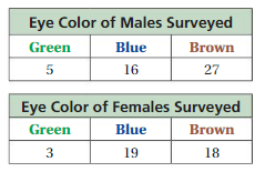
a. Make a two-way table.
b. Find and interpret the marginal frequencies for the survey.
c. For each eye color, what percent of the students in the survey are male? female? Organize the results in a two-way table.
Answer:

Question 15.
REASONING
Use the information from Exercise 14. For each gender, what percent of the students in the survey have green eyes? blue eyes? brown eyes? Organize the results in a two-way table.
Answer:
Question 16.
CRITICAL THINKING
What percent of students in the survey in Exercise 14 are either female or have green eyes? What percent of students in the survey are males who do not have green eyes? Find and explain the sum of these two percents.
Answer:
Question 17.
MODELING REAL LIFE
You randomly survey people in your neighborhood about whether they have at least $1000 in savings. The results are shown in the tally sheets. For each age group, what percent of the people have at least $1000 in savings? do not have at least $1000 in savings? Determine whether there is a relationship between age and having at least $1000 in savings.

Answer:
Question 18.
DIG DEEPER!
The three-dimensional bar graph shows information about the numbers of hours students at a high school work at part-time jobs during the school year.
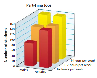
a. Make a two-way table that represents the data. Use estimation to find the entries in your table.
b. A newspaper article claims that more males than females drop out of high school to work full-time. Do the data support this claim? Explain your reasoning.
Answer:
Lesson 6.4 Choosing a Data Display
EXPLORATION 1
Displaying Data
Work with a partner. Analyze and display each data set in a way that best describes the data. Explain your choice of display.
a. NEW ENGLAND ROADKILL A group of schools in New England participated in a two-month study. They reported 3962 dead animals.
Birds: 307
Mammals: 2746
AmphibiAnswer: 145
Reptiles: 75
Unknown: 689
b. BLACK BEAR ROADKILL The data below show the numbers of black bears killed on a state’s roads each year for 20 years.
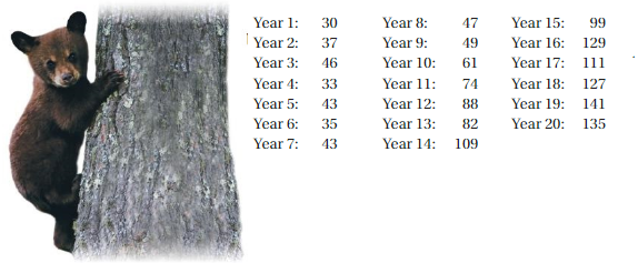
c. RACCOON ROADKILL A one-week study along a four-mile section of road found the following weights (in pounds) of raccoons that had been killed by vehicles.
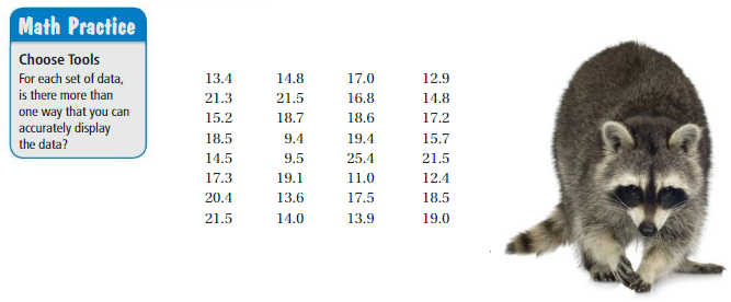
d. What can be done to minimize the number of animals killed by vehicles?
Answer:
Try It
Choose an appropriate data display for the situation. Explain your reasoning.
Question 1.
the population of the United States divided into age groups
Answer:
Question 2.
the number of students in your school who play basketball, football, soccer, or lacrosse
Answer:
Tell whether the data display is appropriate for representing the data in Example 2. Explain your reasoning.
Question 3.
dot plot
Answer:
Question 4.
circle graph
Answer:
Question 5.
stem-and-leaf plot
Answer:
Question 6.
Which bar graph is misleading? Explain.
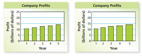
Answer:
Self-Assessment for Concepts & Skills
Solve each exercise. Then rate your understanding of the success criteria in your journal.
CHOOSING A DATA DISPLAY Choose an appropriate data display for the situation. Explain your reasoning.
Question 7.
the percent of band students playing each instrument
Answer:
Question 8.
a comparison of the amount of time spent using a tablet computer and the remaining battery life
Answer:
Question 9.
IDENTIFYING A MISLEADING DISPLAY
Is the box-and-whisker plot misleading? Explain.

Answer:
Self-Assessment for Problem Solving
Solve each exercise. Then rate your understanding of the success criteria in your journal.
Question 10.
An employee at an animal shelter creates the histogram shown. A visitor concludes that the number of 7-year-old to 9-year-old dogs is triple the number of 1-year-old to 3-year-old dogs. Determine whether this conclusion is accurate. Explain.
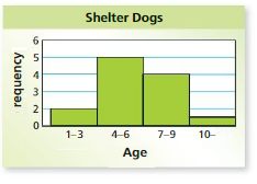
Answer:
Question 11.
DIG DEEPER!
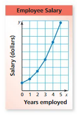
A business manager creates the line graph shown. (a) How do the data appear to change over time? Explain why this conclusion may not be accurate. (b) Why might the business manager want to use this line graph?
Answer:
Choosing a Data Display Homework & Practice 6.4
Review & Refresh
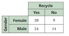
You randomly survey students about whether they recycle. The two-way table shows the results.
Question 1.
How many male students recycle? How many female students do not recycle?
Answer:
Question 2.
Find and interpret the marginal frequencies.
Answer:
Find the slope and the y-intercept of the graph of the linear equation.
Question 3.
y = 4x + 10
Answer:
Question 4.
y = – 3.5x – 2
Answer:
Question 5.
y – 8 = – x
Answer:
Concepts, Skills, & Problem Solving
Question 6.
DISPLAYING DATA
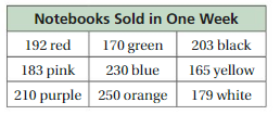
Analyze and display the data in a way that best describes the data. Explain your choice of display. (See Exploration 1, p. 255.)
Answer:
CHOOSING A DATA DISPLAY Choose an appropriate data display for the situation. Explain your reasoning.
Question 7.
a student’s test scores and how the scores are spread out
Answer:
stem and leaf plot shows how data is distributed.
Question 8.
the prices of different televisions and the numbers of televisions sold
Answer:
Question 9.
the outcome of rolling a number cube
Answer:
Question 10.
the distance a person drives each month
Answer:
Question 11.
IDENTIFYING AN APPROPRIATE DISPLAY
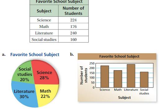
A survey asked 800 students to choose their favorite school subject. The results are shown in the table. Tell whether each data display is appropriate for representing the portion of students who prefer math. Explain your reasoning.
Answer:
Question 12.
IDENTIFYING AN APPROPRIATE DISPLAY
The table shows how many hours you worked as a lifeguard from May to August. Tell whether each data display is appropriate for representing how the number of hours worked changed during the 4 months. Explain your reasoning.
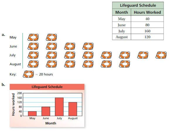
Answer:
Question 13.
WRITING
When should you use a histogram instead of a bar graph to display data? Use an example to support your answer.
Answer:
IDENTIFYING MISLEADING DISPLAYS Which data display is misleading? Explain.
Question 14.

Answer:
Question 15.
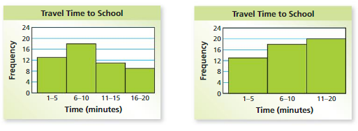
Answer:
Question 16.
REASONING
What type of data display is appropriate for showing the mode of a data set?
Answer:
Question 17.
CRITICAL THINKING
The director of a music festival creates the data display shown. A customer concludes that the ticket price for Group C is more than double the ticket price for Group A. Determine whether this conclusion is accurate. Explain.
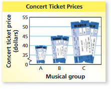
Answer:
Question 18.
PATTERNS
A scientist gathers data about a decaying chemical compound and creates the scatter plot shown.
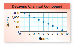
a.The scientist concludes that there is a negative linear relationship between the data. Determine whether this conclusion is accurate. Explain.
b. Estimate the amount of the compound remaining after 1 hour, 3 hours, 5 hours, and 7 hours.
Answer:
Question 19.
REASONING
A survey asks 100 students to choose their favorite sports. The results are shown in the circle graph.
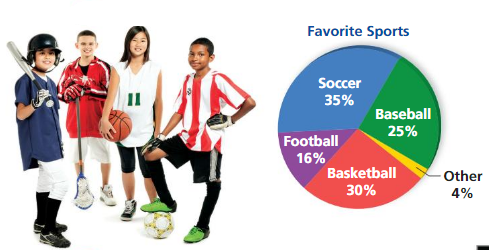
a. Explain why the graph is misleading.
b. What type of data display is more appropriate for the data? Explain.
Answer:
Question 20.
STRUCTURE
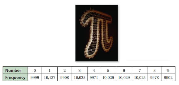
With the help of computers, mathematicians have computed and analyzed trillions of digits of the irrational number π. One of the things they analyze is the frequency of each of the numbers 0 through 9. The table shows the frequency of each number in the first 100,000 digits of π.
a. Display the data in a bar graph.
b. Display the data in a circle graph.
c. Which data display is more appropriate? Explain.
d. Describe the distribution.
Answer:
Data Analysis and Displays Connecting Concepts
Using the Problem-Solving Plan
Question 1.
You randomly survey middle school students about whether they prefer action, comedy, or animation movies. The two-way table shows the results. Estimate the probability that a randomly selected middle school student prefers action movies.
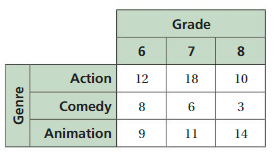
Understand the problem.
You know the results of a survey about movie preference. You are asked to estimate the probability that a randomly selected middle school student prefers action movies.
Make a plan.
Find the marginal frequencies for the data. Then use the marginal frequencies to find the probability that a randomly selected middle school student prefers action movies.
Solve and check.
Use the plan to solve the problem. Then check your solution.
Answer:
Question 2.
An equation of the line of best fit for a data set is y = – 0.68x + 2.35. Describe what happens to the slope and the y-intercept of the line when each y-value in the data set increases by 7.
Answer:
Question 3.
On a school field trip, there must be 1 adult chaperone for every 16 students. There are 8 adults who are willing to be a chaperone for the trip, but only the number of chaperones that are necessary will attend. Ina class of 124 students, 80 attend the trip. Make a two-way table that represents the data.

Answer:
Performance Task
Cost vs. Fuel Economy
At the beginning of this chapter, you watched a STEAM Video called “Fuel Economy.” You are now ready to complete the performance task related to this video, available at BigIdeasMath.com. Be sure to use the problem-solving plan as you work through the performance task.

Data Analysis and Displays Chapter Review
Review Vocabulary
Write the definition and give an example of each vocabulary term.

Graphic Organizers
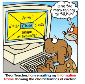
You can use Information Frame an to help organize and remember a concept. Here is an example of an Information Frame for scatter plots.
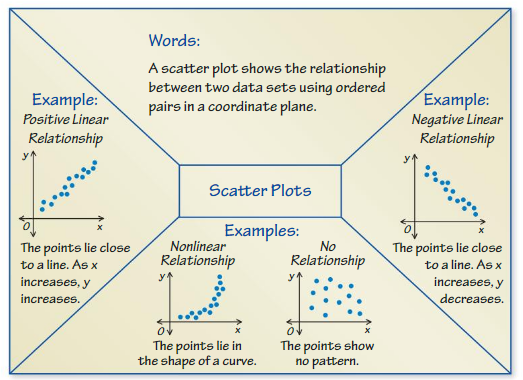
Choose and complete a graphic organizer to help you study the concept.
1. lines of fit
2. two-way tables
3. data displays
Chapter Self-Assessment
As you complete the exercises, use the scale below to rate your understanding of the success criteria in your journal.

6.1 Scatter Plots (pp. 237–242)
Learning Target: Use scatter plots to describe patterns and relationships between two quantities.
Question 1.
Make a scatter plot of the data. Identify any outliers, gaps, or clusters.

Answer:
Describe the relationship between the data. Identify any outliers, gaps, or clusters.
Question 2.
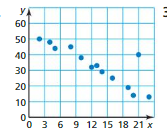
Answer:
Question 3.
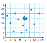
Answer:
Question 4.
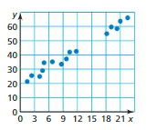
Answer:
Question 5.
Your school is ordering custom T-shirts. The scatter plot shows the numbers of T-shirts ordered and the cost per shirt. Describe the relationship between the numbers of T-shirts ordered and the cost per T-shirt.
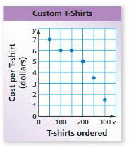
Answer:
Question 6.
Describe a set of real-life data that has each relationship.
a. positive linear relationship
b. no relationship
Answer:
Question 7.
The table shows the numbers of hours a waitress works and the amounts she earns in tips. How many hours do you expect the waitress to work when she earns $42 in tips?

Answer:
6.2 Lines of Fit (pp. 243–248)
Learning Target: Use lines of fit to model data.
Question 8.
The table shows the numbers of students at a middle school over a 10-year period.
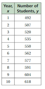
a. Make a scatter plot of the data and draw a line of fit.
b. Write an equation of the line of fit.
c. Interpret the slope and the y-intercept of the line of fit.
d. Predict the number of students in year 11.
Answer:
Question 9.
Find an equation of the line of best fit for the data in Exercise 8. Identify and interpret the correlation coefficient.
Answer:
Question 10.
The table shows the revenue (in millions of dollars) for a company over an eight-year period. Assuming this trend continues, how much revenue will there be in year 9?

Answer:
6.3 TwoWay Tables (pp. 249–254)
Learning Target: Use two-way tables to represent data. You randomly survey students about participating in the science fair. The two-way table shows the results.
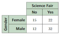
Question 11.
How many male students participate in the science fair?
Answer:
Question 12.
How many female students do not participate in the science fair?
Answer:
Question 13.
You randomly survey students in your school about whether they liked a recent school play. The two-way table shows the results. Find and interpret the marginal frequencies.
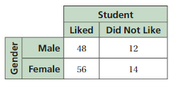
Answer:
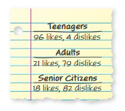
You randomly survey people at a mall about whether they like the new food court. The results are shown.
Question 14.
Make a two-way table that includes the marginal frequencies.
Answer:
Question 15.
For each group, what percent of the people surveyed like the food court? dislike the food court? Organize your results in a two-way table.
Answer:
Question 16.
Does your table in Exercise 15 show a relationship between age and whether people like the food court?
Answer:
6.4 Choosing a Data Display (pp. 255–262)
Learning Target: Use appropriate data displays to represent situations.
Choose an appropriate data display for the situation. Explain your reasoning.
Question 17.
the numbers of pairs of shoes sold by a store each week
Answer:
Question 18.
the percent of votes that each candidate received in an election.
Answer:
Question 19.
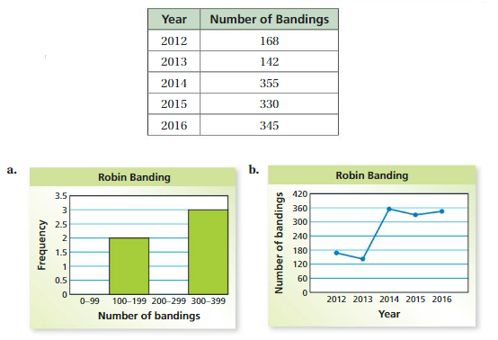
Bird banding is attaching a tag to a bird’s wing or leg to track the movement of the bird. This provides information about the bird’s migration patterns and feeding behaviors. The table shows the numbers of robins banded in Pennsylvania over 5 years. Tell whether each data display is appropriate for representing how the number of bandings changed during the 5 years. Explain your reasoning.
Answer:
Question 20.
Give an example of a bar graph that is misleading. Explain your reasoning.
Answer:
Question 21.
Give an example of a situation where a dot plot is an appropriate data display. Explain your reasoning.
Answer:
Data Analysis and Displays Practice Test
Question 1.
The graph shows the population (in millions) of the United States from 1960 to 2010.
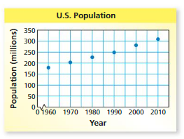
a. In what year was the population of the United States about 180 million?
b. What was the approximate population of the United States in 1990?
c. Describe the relationship shown by the data.
Answer:
Question 2.
The table shows the weight of a baby over several months.
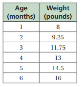
a. Make a scatter plot of the data and draw a line of fit.
b. Write an equation of the line of fit.
c. Interpret the slope and the y-intercept of the line of fit.
Answer:
Question 3.
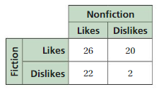
You randomly survey students at your school about what type of books they like to read. The two-way table shows your results. Find and interpret the marginal frequencies.
Answer:
Choose an appropriate data display for the situation. Explain your reasoning.
Question 4.
magazine sales grouped by price range
Answer:
Question 5.
the distance a person hikes each week
Answer:
Question 6.
The table shows the numbers of AP exams (in thousands) taken from 2012 to 2016, where x = 12 represents the year 2012. Find an equation of the line of best fit. Identify and interpret the correlation coefficient.

Answer:
Question 7.
You randomly survey shoppers at a supermarket about whether they use reusable bags. Of 60 male shoppers,15 use reusable bags. Of 110 female shoppers,60 use reusable bags. Organize your results in a two-way table. Include the marginal frequencies. Estimate the probability that a randomly selected male shopper uses reusable bags.

Answer:
Data Analysis and Displays Cumulative Practice
Question 1.
What is the solution of the system of linear equations?
y = 2x – 1
y = 3x + 5
A. ( 13, 6)
B. (- 6, – 13)
C. (- 13, 6)
D. (- 6, 13)
Answer:
Question 2.
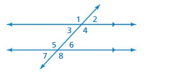
The diagram shows parallel lines cut by a transversal. Which angle is the corresponding angle for ∠6 ?
F. ∠2
G. ∠3
H. ∠4
I. ∠8
Answer:
Question 3.
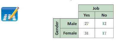
You randomly survey students in your school. You ask whether they have jobs. You display your results in the two-way table. How many male students do not have a job?
Answer:
Question 4.
Which scatter plot shows a negative relationship between x and y?
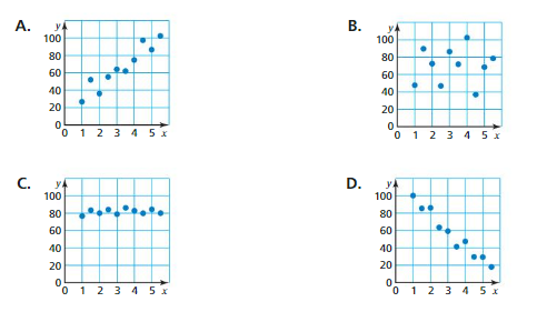
Answer:
Question 5.
A system of two linear equations has no solution. What can you conclude about the graphs of the two equations?
F. The lines have the same slope and the same y-intercept.
G. The lines have the same slope and different y-intercepts.
H. The lines have different slopes and the same y-intercept.
I. The lines have different slopes and different y-intercepts.
Answer:
Question 6.
What is the solution of the equation?
0.22(x + 6) = 0.2x + 1.8
A. x = 2.4
B. x = 15.6
C. x = 24
D. x = 156
Answer:
Question 7.
A person who is 5\(\frac{1}{2}\) feet tall casts a 3\(\frac{1}{2}\) -foot-long shadow. A nearby flagpole casts a 28-foot-long shadow. What is the height (in feet) of the flag pole?

Answer:
Question 8.
A store records total sales (in dollars) each month for three years. Which type of graph can best show how sales increase over this time period?
F. circle graph
G. line graph
H. histogram
I. stem-and-leaf plot
Answer:
Question 9.
Trapezoid KLMN is graphed in the coordinate plane shown.
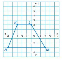
Rotate Trapezoid 90° clockwise about the origin. What are the M’, coordinates of point, the image of point M after the rotation?
A. (- 3, – 2)
B. (- 2, – 3)
C. (- 2, 3)
D. (3, 2)
Answer:
Question 10.
The table shows the numbers of hours students spent watching television from Monday through Friday for one week and their scores on a test that Friday.

Part A Make a scatter plot of the data.
Part B Describe the relationship between the hours of television watched and the test scores.
Part C Explain how to justify your answer in PartB using the linear regression feature of a graphing calculator.
Answer:
Conclusion:
Get the free access to Download Big Ideas Math Answers Grade 8 Chapter 6 Data Analysis and Displays from here. All the solutions are prepared in a simple manner. Test yourself by answering the questions given at the end of the chapter. Keep in touch with us to get the Solutions of all Big Ideas Math Grade 8 Chapters.
